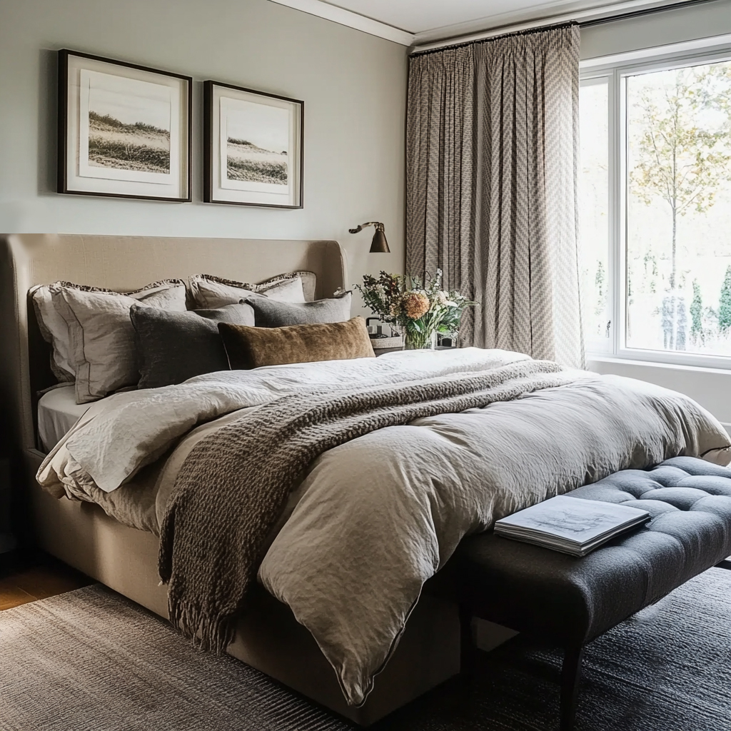
Mixing Patterns with Intention
There’s a true art to mixing patterns well. Designers don’t rely on guesswork—we use a set of principles to create balance, depth, and harmony in a space. Whether we’re layering pillows on a sofa, styling a bed, or designing an entire room, three elements guide the process: scale, print, and color.
Scale: Creating Balance Through Proportion
Scale is all about the relationship of one pattern to another. A single piece has no scale until it’s placed alongside something else. When patterns are layered thoughtfully, scale keeps the eye moving without overwhelming the senses.
Imagine three geometric pillows styled together: one with bold, oversized lines that read as minimal, another with a medium stripe that feels balanced but busier, and a third with fine, intricate lines that bring energy and movement. Alone, each pillow feels incomplete. Together, they create rhythm through variation in scale.
Designer Insight: Keeping prints within a similar color palette creates a monochromatic, understated look, while still allowing scale to do the work of layering interest.

Print: Adding Personality and Interest
Prints are the visual language of design. They bring movement, character, and expression into a space. From timeless geometrics to soft florals and bold animal motifs, prints set the tone for how a room feels—whether calm and restrained or layered and energetic.
When styled thoughtfully, prints complement one another rather than compete. For example, imagine a solid pillow serving as the neutral anchor. Against that backdrop, a bold stripe introduces rhythm while a geometric pattern adds structure and edge. Each print plays a distinct role, creating visual interest without chaos.
Designer Insight: Variety matters. Pairing multiple prints of the same type can feel flat, but combining different motifs within a cohesive palette creates depth and intentionality.

Here’s another way to think about it: three completely different prints can live beautifully together—even without a solid to anchor them—when each one serves a distinct role. Imagine a graphic animal print paired with a classic stripe and a soft floral. On their own, they speak different design languages. Together, they create a dynamic yet harmonious composition.
Designer Insight: When prints share a unified color story, the look feels bold yet monochromatic—striking without tipping into chaos.

Color: The Thread That Ties It All Together
Color is often the most powerful tool in pattern mixing—it’s what creates cohesion and sets the overall mood of a space. To work with color effectively, start by…
- Choosing a patterned piece you love. This will become your guide.
- Pull the secondary hues directly from that pattern and echo them throughout the room in complementary prints or solids.
Digital tools like Sherwin-Williams ColorSnap can be helpful for visualizing the palette, but what matters most is simply identifying the range of tones present. When you repeat those colors across different scales and prints, the design feels intentional and layered rather than accidental.

Once you’ve identified the palette within your lead pattern, the next step is…
3. selecting supporting pieces. For example, if the dominant color in your pattern is a deep navy, avoid repeating it in the same bold proportion elsewhere—it can overwhelm the composition. Instead, look for accents that feature just a touch of that navy, woven in subtly to create connection and flow.
Designer Insight: Introducing additional colors in smaller doses adds richness and creates a layered, more colorful design story without losing cohesion.

The Grand Finale: Bringing It All Together
The most dynamic spaces are created when scale, print, and color are layered with intention. Imagine a vignette anchored by a bold pink pillow in a large-scale design, balanced by a medium-scale graphic print in front, and finished with a small-scale blue pattern. Each piece plays its role—large, medium, and small; stripe, geometric, and animal print—working in concert rather than competition.
What makes the arrangement cohesive is color: the hues from the outer pillows are drawn directly from the graphic print in the center, creating a palette that feels curated rather than chaotic. This harmony of scale, pattern, and color transforms a collection of pillows into a bold, statement-making design.
Designer Insight: When all three elements are thoughtfully combined, the result is layered, sophisticated, and unforgettable.
Some Other Examples…

The next time you’re selecting textiles or accessories, pause to consider the mood you want the room to convey. Should it feel monochromatic and serene, layered with color, or bold and expressive? Scale, print, and color can each stand on their own, but when combined with intention, they create depth and sophistication that feels truly bespoke. My hope is that this guide offers you a glimpse into the artistry behind mixing patterns—and inspires you to see how a professional approach can transform the way a space feels.

Meet Savannah and Dillon
We're just a couple of brand and website designers sharing the unfiltered version of our experiences as business owners, the obstacles we've overcome along the way, and what it's really like working from home with your spouse. So, please feel free to settle in. We're so glad to have you.
Categories
Free Business Start-Up Guide